With all marketing campaigns, it is really important for there to be continuity across all of the media products that are being used to promote the film, in oder for the audience to realise that all the texts are promoting the same film. A unified campaign helps to establish an awareness of the film, constantly showing the audience images associated with the film, so that when they make a choice about what to see in the cinema, the film will be fresh in their minds.
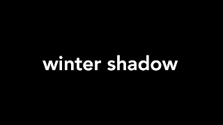
I tried to make sure that there were consistent, unifying elements throughout my campaign. The font for my title on and teaser trailer and on my poster are the same, making them instantly recognisable as belonging to the same film. When I conducted my research I had to be selective with the font that I chose as I knew I would be using it for both. It had to be effective on both the poster and in the teaser trailer. The font that I used is called 'Avenir' and I used this on my titles, tag lines and real ease dates for both my poster and teaser trailer.
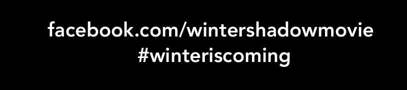
Alongside using the same font I made sure that I repeated my taglines in both the teaser trailer and on my poster, alongside having the release date and social media links.
Images of my main stars appeared in both my teaser and my poster, and to link the film with my magazine cover I also used an image of my female lead (which would be part of a press kit distributed to media outlets as part of the film's promotion).
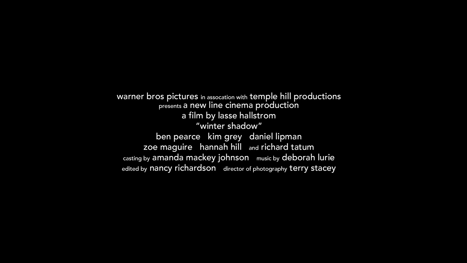
Other factors that were similar across the products were production company logos on both the teaser and the poster, as well as billing on both, and the prominent use of the film's title across all of the elements of my marketing campaign.
Throughout my research and planning I conducted many focus groups among my fellow students, my out of school friends, and my family at home in order to help me with things like design and titles in order to find out what people would expect see see and think of as authentic.
As my project is a marketing campaign, I realised that it was essential that I thought about the ways that I could deliver meaning to my audience most clearly, so that they would want to see the film. An example of one of my initial questionnaires (on posters) can be seen by clicking on the link below.
I made many of my decisions, regarding font choices, types of images to use and even the title of the film, on the basis of my findings of these focus groups and questionnaires as I felt it was important to take into account the audiences opinion and respond to their ideas. Once I had completed my marketing campaign, I conducted further audience research to see if I had successfully achieved my aims in conveying genre and authenticity.
With my poster, I asked the following questions:
1. Is the genre easily identifiable? How?
2. How important is the central image in terms of attracting you to the film?
3. Does the colour scheme work? Is it reflective of the film's genre?
4. Compared to existing posters, does it feel authentic?
My respondents felt that the poster was instantly recognisable as belonging to the romantic drama or melodrama genre, pointing to the pink and white colour scheme of the font, the font itself (particularly the fact that it was in lower case), the image of a couple in a loving embrace and the moody background sky signifying that despite their love for each other there may be trouble ahead for the couple's relationship. Other factors that they felt indicated genre were the release date (February 14th, a date typically associated with romance, and the time of year that romantic dramas and melodramas are often released), the taglines which suggested the typical narrative patterns of movies from this genre and the references to existing films from the genre such as 'Safe Haven' and 'The Notebook'. I was pleased with these responses as I had based most of these decisions on the research that I had done into genre.
Women in particular, suggested that the dominant image of the couple would be a contributing factor in encouraging them to see the film, as it instantly suggested not only genre but also that the film would focus on the protagonists' relationship (the men I asked suggested the opposite, that the image would put them off seeing the film as they felt it indicated it would be full of romance).
Most people felt that the colour scheme was appropriate in terms of genre, with the mix of soft whites and pinks, though one or two people suggested that the whiteness of the film's title didn't stand out enough against the white top that the male protagonist is wearing (many felt that this was even more problematic for the tagline, which is much smaller).
I showed my respondents a selection of the posters from films from the genre that I had analysed and asked them whether they felt that mine was realistic. From a genre perspective they suggested that it contained many of the stereotypical elements that are found on posters from this genre. They also commented on elements that were typical of posters such as the billing, production company logos, release date, social media links, reference to other films and an image of the main characters. I was pleased that the majority of people I asked felt that it could pass for a real movie poster (apart from the fact that many of them recognised the actors as friends of theirs).
I asked the following questions in relation to my finished magazine cover:
1. Can you tell whether this is a mainstream film magazine or an independent film magazine?
2. Can you see how the magazine links to other elements of my marketing campaign?
3. Do you think that the magazine would stand out on the shelf?
4. Does it look like a real film publication?
Before my respondents were able to answer the first question I had to show them examples of existing mainstream film publications and independent film magazines.
Once I had done this, the response was quite interesting. Many people said that they felt that the muted colour scheme made it look more like an independent film magazine, such as Sight and Sound, whereas the coverlines which focused on mainstream stars (such as George Clooney and Channing Tatum) and big Hollywood movies, such as 'Pitch Perfect 2' and 'Kung Fu Panda 3', made it feel more like a mainstream magazine such as Total Film or Empire. They felt that the font was reminiscent of Total Film and that the layout itself, with coverlines, banners and the price tucked within the masthead was typical of mainstream film magazines.
Even though my lead actress is wearing casual clothes, they could tell that the magazine was promoting the film, as her image was familiar from both the poster and the teaser trailer (where she appears a number of times), and the main coverline made reference to the name of my film.
In order to make the magazine stand out more on the shelf, people felt that I maybe should change the colour scheme to something brighter and more prominent than greys, greens, blacks and whites, so that the magazine would be more eye-catching. They did feel, however, that the layout looked professional and that this signified to the reader that it was a quality product.
Finally, the respondents felt that my magazine looked authentic, commenting on the way I had incorporated all of the main conventions that they would expect to find on a real magazine, such as banners, a masthead at the top of the magazine, date and issue number, an image of a star and coverlines related to big budget Hollywood films.
I also asked the respondents the following questions about my finished teaser trailer:
1. Have I incorporated the elements you would expect to find in a teaser trailer?
2. Can you tell what genre the trailer belongs to?
3. Would the trailer encourage to go and see the film?
4. Does it feel like a real trailer?
I showed my respondents some of the trailers that I had analysed during my research to familiarise them with the conventions of trailers, before asking them the first question.
My audience had certain expectations about what to find in a teaser trailer and felt that mine seemed realistic as it included elements that they expected to find, such as the production company logos at the beginning, images from the film that help develop the storyline and indicate genre, taglines that appear at regular intervals and the closing captions. They also felt that the music was typical of the type of music found in trailers for this type of genre. One final comment they made was about the style of editing - they felt that fades were typical of teaser trailers and helped it feel more realistic.
The most important piece of software that I used during my editing was Avid Media Composer - this was where I edited my teaser trailer.
Before editing I put all of my footage into bins, so that I had easy access to each movie clip when I needed it.
I also created bins for my montage, sounds that I wanted to use (such as sound effects and music) and a bin for the still images I had created, such as the title, taglines, the billing and the release date and production company logos.
Once I had arranged all of my bins I began placing my images, video clips and sound files on the timeline. The multitrack meant that I was able to add different layers of audio and video, and add fades and cuts where I wanted them, moving each element around as I desired. Having two screens meant that I could edit more easily.